


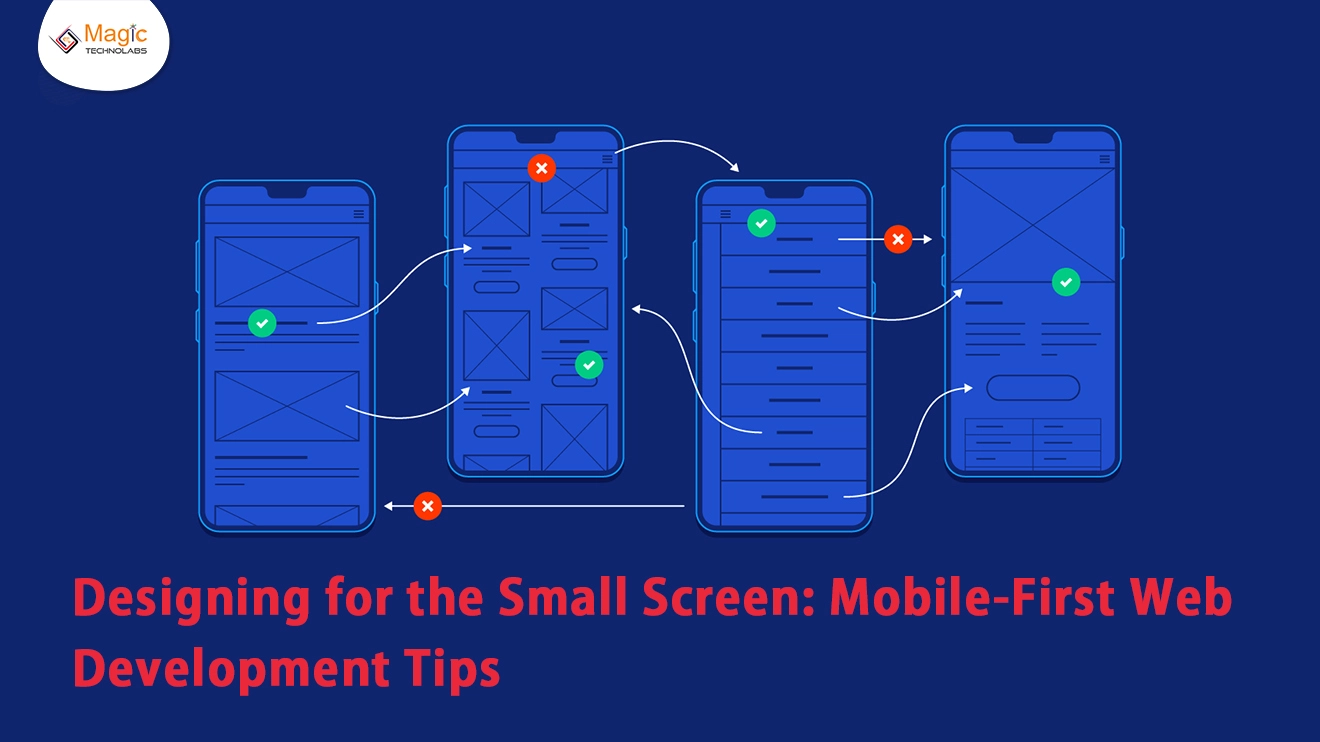
In a digital landscape dominated by handheld devices, "Designing for the Small Screen: Mobile-First Web Development Tips" takes center stage, offering indispensable insights for crafting websites optimized for mobile users.
1. Embrace Responsive Design Principles
Mobile-first web development starts with responsive design. Prioritize flexibility in layouts, images, and navigation, ensuring your website adapts seamlessly to varying screen sizes. This foundational step sets the tone for an inclusive user experience.
2. Prioritize Speed and Performance
Mobile users demand swift loading times. Optimize images, minimize HTTP requests, and leverage browser caching to enhance your site's speed. Prioritizing performance not only improves user satisfaction but also positively impacts search engine rankings.
3. Streamline Navigation for Thumb-Friendly Interaction
Consider the ergonomics of mobile users by designing navigation that accommodates thumb-friendly interaction. Intuitive menus, strategically placed calls-to-action, and simplified navigation contribute to a smoother user journey on small screens.
4. Optimize Content for Mobile Consumption
Condense and prioritize content for mobile consumption. Craft concise headlines, use legible fonts, and break content into easily digestible sections. Optimize images and multimedia elements to strike the right balance between information and engagement.
5. Leverage Mobile-Friendly Features
Explore mobile-specific features to enhance user engagement. Utilize geolocation, touchscreen gestures, and device orientation for interactive and personalized experiences. Implementing these features not only adds functionality but also aligns with user expectations.
6. Test Across Various Devices and Browsers
Mobile devices come in various shapes and sizes. Rigorous testing across different devices and browsers ensures a consistent and reliable user experience. Identify and address any inconsistencies or issues that may arise during the testing phase.
In conclusion, "Designing for the Small Screen" isn't just a matter of adaptation; it's a strategic approach to elevate user experiences in the mobile realm. Embrace mobile-first web development principles, prioritize speed, and create content that resonates seamlessly with users on the go. The small screen is a vast opportunity — seize it with user-centric design and optimal functionality.